Saturday, December 18, 2010

MAC, Blue India


 Hmm. I'm a little late on the uptake here, right?  All things considering--Mac's Blue India having come out about nine months ago or such. Oops!

I won this polish from a giveaway that Wan from I Love Nail Polish (Hi Wan! Thanks for the polish! I miss your blog posts!) held a while ago.  I received the package, oohed and aahed over its contents, and then it just sat in my stash, collecting dust. 

See, I'm actually a seasonal polish wearer (I've been wearing exclusively red/green/glittery stuff lately, due to the christmas season--and once that passes I'll probably throw myself into the pale blues and greys that always remind me of the winter) and dusty colors feel most appropriate to me in the fall. And then Blue India is, well, blue--and I wear most of my blues in the winter. So really, this is actually the most perfect time for me to debut this polish. Yes?

No?


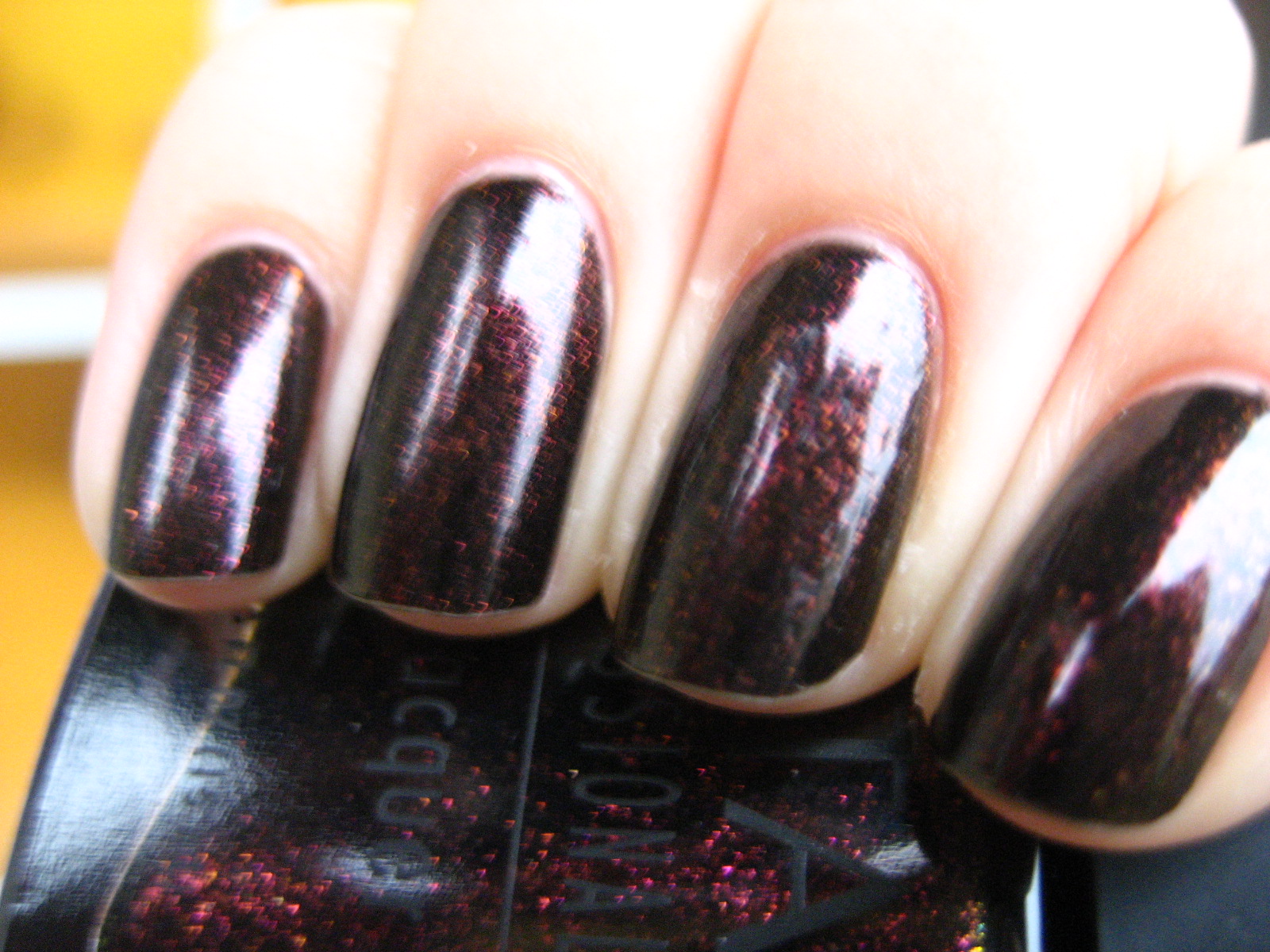
Well, in any case, it's lovely:  two smooth, easy to apply coats (bravo, MAC! It's about time) of a perfect blue-grey that makes me think of stormy skies along the coastline. It's a melancholy shade that goes well with all the blues, greys, and blacks in my wardrobe, but would probably provide a counterpoint to pale pinks and creme shades in the spring. The pictures are after a day of wear--as you can see, it's still very intact. 


(Urgh, cuticles. Macro, why are you so unforgiving on my hands?) 

I like the way the color shifts from being more blue or more grey depending on its lighting.  The above picture is far more blue than the one before that. Oh Blue India, you are so temperamental. :)

Thursday, December 16, 2010

OPI, Let Me Entertain You


When I first put on this polish it reminded me quite viscerally of the polishes I used to wear four years ago:  mostly bright, metallic, almost-offensive hot pinks/fucshias/magentas that were not creme in any way, shape, or form. Let Me Entertain You could've nestled quite well with that old collection (I used it up).  I'm not sure how I feel about that.


On the other hand, Let Me Entertain You is most certainly a winner of a polish:  it's a bright, saturated, not-quite-pink-or-red polish in that glassflake-shimmer finish that's been so popular lately.  (I'm beginning to think that this finish is the perfect alternative for people who love the way glitter looks but hates the way it removes.  These aren't hard to remove at all with a good square of felt and your favorite nail polish remover.) I used two coats here and, although it's quite bright and true to the bottle, you can see a bit of VNL.  If I wasn't so lazy I'd do a third coat. 


I'm really loving that hot pink flash you see on the nail.

I have to admit:  I think that Let Me Entertain You is the winner of the OPI Burlesque collection. I was feeling kind of 'meh' about the multicolored glitter--I like mine a little more fine and a little less multicolored--and I thought Tease-y Does It was really close to Ulta's For Bitten.  I own The Show Must Go On and despite the amount of compliments I get on the color I can't quite get into it. But this one is showy, nostalgic, sassy, and I relish in the nostalgia and the brightness of my hands. :) It's a lovely color.


For anyone who's curious--it's also a dupe of Zoya Alegra. I'm fascinated to see how it'll compare to Hard Candy Fabuluxe, but I can't illustrate the comparison myself since I don't have the Hard Candy. Obviously the finish'll be different, but still...

Hmm, lots of dupes going on this year, dontchathink?

Tuesday, December 14, 2010

BB Couture, Vampy Varnish (take 2)


This is one of my favorite polishes ever (it made the top 20 twice), but I've never ever ever been able to capture a good picture of this one.  It is a black jelly with BBC's famous micro gold/green glitter, and it looks like the universe. 


What you see here are three coats to get rid of any less pigmented spots on the nails.  The polish is a little thicker than average and you may want to thin it for better control--I just work with it. Despite the glitter it's smooth as glass with one good coat of topcoat. I'm currently using Essie's Good to Go!. 


Some bright bottle love (oh, look, there's a crack! Oh no! I'm sorry, Vampy Varnish. D:) 


 And here's how I've been wearing this polish lately...

Sunday, December 12, 2010

China Glaze, Dynasty


One of my favorite holiday polishes thus far.  I love the warm, tomato-red jelly, the flashes of different-sized holographic glitter.  It is sparkly and wears ridiculously well. Three coats. 


Sometimes glitter like this reminds me of the flurry of snow. :) 


And blurry to show a little bit of its holographic spark..

I know I haven't been posting as much as before, but work just keeps piling! Please stay tuned, you guys:  I've a giveaway coming up!

Sunday, December 5, 2010

Franken, Vincent


This is my second attempt at creating a starry night franken.  It is by far my favorite.


I used a mostly empty bottle of Color Club Sex Symbol (all the glitter dried up on the edges), Borghese's Mezzanotte Blue (about half a bottle or more, I don't remember), and clear, regular topcoat for the rest of it. 


(Excuse my cuticles!)

The color is vivid and flattering on my skin, the polish goes on smooth but a little thick in two coats. It wore on me for ages.


I also like how the glitter is of different sizes and looks pale blue because of the way the jelly glitter covers it. I also like how some glitters float to the top and remains silver, giving it depth. I just really like this polish. It was easy to make and wonderful to wear, and really, what else are we looking for in a franken other than that?

Friday, November 26, 2010

Nars, Zulu


Ah, Nars Zulu. My first giant lemming.  Started by perusing innocently through a bunch of blogs before finding my blackened-green jelly love that also happened to be ridiculously expensive and impossible to find without forking an untold amount of money on eBay. 


I blame my addiction to true, deep greens entirely on Nars Zulu. I even blame my need for jellies as dark and moody in color on Nars Zulu.  I used to want to attempt frankens, I considered buying Anna Sui's 915 (just as hard to find and elusive). I didn't believe all the hushed and frantic rumors that Zulu would be re-released. Why would such a thing come so easily? Who, besides np collectors like myself, would desire such a thing? It was a hopeless cause.


Except that Nars did re-release Zulu. And imagine my  surprise when a little box filled with deep green jelly goodness showed up on my doorstep!


Zulu is two coats, with perfect application--like all jellies of its kind, it initially applies streakily and eases and levels with the second coat. It is lovely--deep near black in indoors light and shade, a true emerald in sunlight.


Oh, Zulu. We are meant to be.

Wednesday, November 24, 2010

OPI, We'll Always Have Paris: Take 2


I don't get it.  Last year, when I swatched this for the first time (don't look, people; the swatch is horrendous), the color looked... well, plum. Now it looks brown. So brown, in fact, that I'm beginning to wonder if I should do a comparison between this polish and RBL Au Chocolat--they've both got that red-brown chocolate-syrup color thing going on.

Anyway, two coats.  Perfect.

Have a wonderful Thanksgiving, everyone! 

Monday, November 22, 2010

Orly, It's Not Rocket Science


Um, I really love this.

I think it might be safe to say that I thought Orly's Cosmic FX collection was awesome to begin with, but I own three of the colors and I love every single one of them to pieces. Look at this one.

On a lot of people, I know that It's Not Rocket Science read as a really, really glittery puke/slime/snot green. On me, it's very grassy. It reminds me of leaves, due to its texture and depth (see how it seems darker beyond the shimmer plates? See how when the light hits it, only the center turns a bright lime green? A deep, olive green color in shade?


Yeah.

Frankly I'm curious to see how this polish will hold up against Orly's blue-tinged green version, Meet Me Under the Mistletoe (I haven't swatched it yet), but I imagine that the colors would have a lot in common.


This is two coats (thickish:  I've discovered that thick is the best way to get all the shimmer particles where you want 'em) and I had no problems with this.  FYI (although most of you know this already), ChG's Zombie Zest is a dupe of this color. So is SpaRitual's Optical Illusion.

Saturday, November 20, 2010

Franken, Strawberry Sorbet


I created this franken in the attempt to create something soft, squishy, sheer pink, and glittery--probably after all of the lemming I did for ChG Carnival Lights. (I own Carnival Lights now. Is it dupey? No. Is it even similar? Not to my eye. Are they related? Yes.) 

I don't even remember what goes into this--a little bit of Essie Jelly Apple, a lot of Wet n Wild's Kaleidoscope, and the remnant of that dodo pink japanese color that was my first Lemming Monster post.


Ignore the stainage.

This is three coats and relatively easy to make, and cute:  I wore it to work for a couple of days and nobody even batted an eye (not that they ever do. More on that later). The pink masks the horrible yellow color that my nails have become and allows for a simple, clean look with a kick--for me, this means that this franken is a perfect palate-cleanser when I'm feeling oversaturated with polish.


So, the thing about work-appropriate polish:  I work full-time now and I wear whatever dang nail polish I like. Nobody has said a thing. I got tons of compliments on Space Cadet. Take heart, ladies! Work-appropriate does not mean the same thing in every office.

Thursday, November 11, 2010

Franken, Silk and Velvet


Silk and Velvet is a franken of circumstance, and is the last franken I've ever made without measuring out and thinking about how much of each color in proportion to the bottle. The last. From this point on my frankens became more intuitive--and oddly enough, a lot prettier. Except now that they're prettier I can't give you recipes other than what I know went into it. Sigh.

Anyway.  I made Silk and Velvet with, oh, my mom's old colors that reeked of the early 2000s.  Frosty metallic red. Warm pink with gold frost.

Not interested. So I frankened with them! Here's the recipe:

SILK AND VELVET:
-1/4 Sinful Colors Fire Red
-1/16 Nfu-Oh 119
-1/4 Sinful Colors Sharon's Heart
-3 drops Sally Hansen Invisible
-Shake Well


I'm not entirely sure if it's the creme blue or the clear polish that I threw into this, but it's not frosty at all--this is a deep, wine shimmer with a slight silver sheen--gold particles are interspersed throughout. Not enough to tell on the nail, obviously, but it's prominent in the bottle and you can occasionally catch snatches of the gold in light.

I like its texture, of which I actually do not own much of:  its sheen is satiny, its look is somewhat luxurious. I might wear this again during holiday season, although it looks autumnal as well.

Oh--the application was somewhat goopy and it smells like franken (it stinks) but it settles well and wore well.  I think that application issues might arise more from the bottle than the polish, actually--I've used it for frankening about 3 times and I think all that acetone has made it somewhat difficult to work with.

Tuesday, November 9, 2010

Wet n Wild Craze, Rustic


Y'know, since autumn started I've worn this polish three times. Three. As a blogger and a nail polish collector I'm sure you can imagine that this sort of thing doesn't happen very often, wearing the same polish multiple times in a season and all (except that one time during Lent when I had to choose four polishes and wear just those for the entire duration. Blargh.), but yes. I wore Rustic three times.

There are a couple reasons for this:  firstly, Rustic is gorgeous. It's a beautiful glowy metallic dark brown/bronze/copper color. See the way the light hits it at the bottom? It darkens the edges, and I can totally understand now why people love these "glow from within" polishes.


Secondly, the application is excellent. The brush is short and is somewhat difficult to work with, but it's not the fault of the polish as much as it is the bottle.  Two coats. It dries quickly and you're ready to go.


 Lastly (and on a more nostalgic basis), I wear bronze a lot in general because it was the first nail polish color I ever owned that was out of the pink/red/black range.  I remember being very nervous about it (despite friends rolling their eyes and telling me that it was gorgeous) and kept thinking it was too close to my skin tone, it looked unnatural, etc.

Then I discovered that very shiny bronzey colors look great with navy. It all goes down from there.


I pull on this polish whenever I feel the need to remember where all of this madness came from. (Also, to match it with navy.) Does anybody else have a color that they blame their nail polish collection on?

Thursday, November 4, 2010

NOTD: Seashell Shards


Okay, so... this isn't the best picture ever. Every nightmare I can think of for horrific nail pictures are in here. Stark lighting. Bubbles. Crazy lumpy topcoat. Shrinkage.

But this is because I made a mistake, and the mistake occurred because I have no patience. Here's the story:

I received a packet of pink-to-lavender crushed seashells from Viva La Nails in the mail and was trying to figure out how to utilize them in every day nail art when I thought, "hey, I can just use them like abstract rhinestones. Also, wouldn't it be cool if I could use them like, oh, I don't know, broken up mosaic pieces?"

This is the result. The problem is that if you have four coats of a pale pink streaky nightmare polish and nail art, you don't actually want to put quick-dry topcoat on it. Ever. Or that nightmare you see above occurs.

I've actually tried this on the opposite hand (I didn't take a picture because I am also horrible with non quick-dry polish and dinged my nails), and I can verify the above paragraph is truth.

On the whole, though, the image from far off isn't so bad:


(See, this is the opposite, dingy hand. Other than the dings, the manicure was a success here!)

I like how it looks like broken glass pieces. This is basically four coats of Nubar seashell, and then I pressed on the seashells at random with my opposite hand. Because the shells are rough in texture they just sort of stick to your skin; I just press it onto the nail from there. Use a light touch and do not use quick-dry topcoat. The end result is very cool.

See? The picture below is my favorite: 


(ignore the bubbles. I really should've tried the look on black.)

It's odd, like a 3-d gradient/mosaic/flower petals. :) I like it.

(the polish is mine, but the shells were sent to me for review.)

Sunday, October 31, 2010

Ulta, For Bitten


Happy Halloween, everyone!

I've got one last Halloween-inspired manicure for y'all today, and that is Ulta's For Bitten.  This shade was launched in a mini collection last year and inspired a huuge collecting frenzy, so imagine my surprise when I walked into Ulta and found a full-size bottle of this beauty!

I had my trepidations about this one, to be honest.  The polish has this wonderful duochrome shimmer in its bottle--green to gold to a deep warm purple--that my instinct told me wouldn't transfer at all on the nail.

Wrong. Gloriously wrong. Observe:


(Gah, I know it's blurry.)

Here is the polish giving off a deep purple glimmer. It occasionally flares red at an angle like this when facing the light.


Here, you can see its transition to gold.

This is really, really pretty and really, really effortless. Two coats, no complaints on application. It dries quickly and lasts for quite a while--I think I wore this for three days. The shimmer seems subtle from the pictures that I'm showing you, but I've also received an unbelievable amount of compliments on this--no regular black creme to the human eye, this one. It glares colors.


And look at that bottle!

This is my favorite black creme with colored shimmer to date.  I like this a tad bit better than I like voodoo, but they evoke different moods.

I'm still feeling the kick for these irregular shimmer particles that Orly FX and Zoya Sparkles ran away with.  I know other people are getting really tired of them, but man! Look at what these babies can do! They give you glitter-like sparkle, foil-like texture, and are very easy to remove. More please, and in more colors than, say, Space Cadet, which has two dupes out already. (I love Space Cadet, but seriously?) Or Zombie Zest/It's Not Rocket Science. Or Mr. Wrong/Purple Gala. Or Galaxy Girl/Formidable!.

Still, in the meantime, I'm gonna be overdosing on cremes in November since I'm a little oversaturated on the other finishes this month. Besides, sparkle season (Christmas!!! New Year's!!!) is coming up and I need to be ready for that, too. Who's with me?

Also, who'd appreciate a little RBL spam the night before the madness happens?