Thursday, October 29, 2009

Sephora by OPI, Metro Chic

So, 212 wears REALLY well. I realize that this probably doesn't belong in this post, but I needed to clarify: I was wearing it because I was lazy, but about three days in I wasn't feeling the glitter anymore. It has nothing to do with 212--it wore as though I'd put it on just hours before for THREE DAYS, amazing--it has to do with me being totally ADD and wanting to wear something somber and moody and plain. And not black. I'd been wearing black for the past one and a half weeks. Too long.

It comes off like every other glitter: painfully. Be very careful or use the tin foil method or buy the acetone tub that sells pretty much anywhere. I happened to have the tub before, so I used it to get rid of the glitterfest that is 212. It's a sponge though, not mini-brush.

Enter Metro Chic. Metro Chic, if you hadn't been paying attention in 2008, is the SOPI color that kept being out of stock and was scalped tremendously at evilbay. Anyway, it's more or less always in stock now. I bought this during the F&F sale last week.

Indoors.
Outdoors, sunlight.
Outdoors, shade.
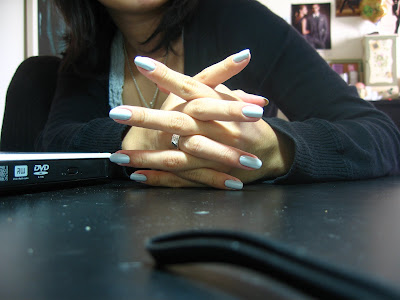
Further off. Please excuse the frazzles and the bump on my ring finger; the causes of that is both sudden cold and peelies. :D (yaaay, peelies.)

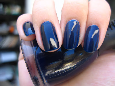
This is two coats (you need both; it's a translucent wet concrete color at first coat, but you probably don't need more than two) and oh BOY does it apply perfectly. The first polish in a long time that I hadn't had to clean up at ALL--it is just how you see it. It dries quickly, too, for a creme, and so I am incredibly impressed. And what a color! Just what the doctor ordered--moody, neutral, sophisticated, surprisingly complex. I didn't bother taking a picture in near-darkness or under yellowy light, but basically in shadows, Metro Chic looks like a taupe. In light, the purpliness is totally evident. And, of course, I will always see the grey in it. :)

Basically my point is that I love this polish. Somehow, it's sort of perfect. Kind of pricey at 9 bucks (admittedly, I seem to be the type that hardly pays under the retail price of five) but I think the quality of this polish is comparable to RBL (we'll see about the wear later, though: I can't report on either this or 212 atm, mostly because I'd changed polishes before they chipped and because metro chic will have to be removed on halloween for a manicure that matches my costume). Here's to hoping that $OPI seems to be worth the investment!

Monday, October 26, 2009

Sephora by OPI 212


... What a strange old polish, you guys. I mean, look at it. It's like a frankenfail, or fairy puke all over asphalt more than it's like ultra-glam district of New York. Don't you think? There's something about this polish that hardly seems cohesive in what it looks like. It really is like Suze and company just threw together a bunch of extras and called it a day.

And yet... it's kind of awesome.

Outdoors, sunlight.

Outdoors, shade.

Indoors, angle.

Please click on the pictures for full-size glittery awesomeness.

It doesn't remind me of the cosmos, or of city lights, or whatever poeticism seems to be popular in defining 212. It reminds me, very very specifically, of the way a street looks after a party. The gritty remnants of confetti; the smoky sparkle in the sky after fireworks. If it reminded me of the cosmos, it'd be one of those dusty galaxy pictures with yellow clouds. It reminds me of happy things long gone, with the fuzzy memory of it left behind.

Which is probably why I like this polish. It strikes me as being a party polish not because it's blingy and fantastic but because its blinginess is so messy and nostalgic. I'm wearing it for halloween madness this week (and also because I'm lazy and can just paint it over the aforementioned Raven--by the way, the pinky is all 212 without an opaque black base, but it needed three coats. The rest are two), but I imagine that I'd wear this during New Year's.

Or maybe--right after holiday madness. Just to reflect what the rest of me feels like after it's all over and done.

... Yeah. I like this polish.

Zoya Raven

So. My first non-pink polish was a black one and I'd used it up--oh, last summer. So when I went on search for a new one, I'd decided to splurge during Zoya Insanity on the Raven, who is the reported Chanel Black Satin dupe. Of course I went for it.

I'm kind of in love with it, too, but details on that below:

Indoors--I can NEVER give indoor pictures clarity, for some reason.
Far off.
Sunlight.

This is two coats of Zoya Raven: it only needs two coats, but it most definitely needs two coats: the first coat is sheer. What makes this polish unique from the average flat black creme is first its lack of pigmentation: this is clearly a base color polish; not a complicated nail art polish at all. Second is the "satin-y" silver finish that glimmers just so on the surface of the nail: I think you all can kind of sort of see it on the pinky finger on the last picture. It's there. It is indeed reminiscent of black satin ribbons. It is also reminiscent of that strange silver sheen in raven feathers. It is very glossy and very sophisticated--given that you can make it not chip.

This is fun, because a lot of people complain that Zoya is chip-effing-tastic. I actually found that it stayed pretty well on my fingers for a dark polish--I'm changing it now after three days or so because my thumbs have chipped badly and needs more protection. I don't necessarily think it's bad, but... I'm not fond of black polish anymore. I don't know why; I'm just tired of it. Maybe I need to put Raven away unless I need a good base for another art experiment--I can't imagine just wearing this just because.

Thursday, October 22, 2009

NOTD: Splatter

indoors
outdoors, sun.
outdoors, shade


These are two coats of Zoya Raven, and then Missha BR102. It's easy: paint the base color, and then remove as much of the secondary color as you can. Brush on top of the dried base--the streakier, dirtier, more textured, the better. Do it until you are satisfied with each nail.

I put on topcoat to emphasize the shiny (and oh, how shiny it got!) but you don't have to put on top coat if you want to emphasize the gritty texture of the nail. I assumed that the grittier it felt, the less 'on-purpose' my nails would look. Didn't want that.

Anyway, I'm completely in love with this look. It reminds me of tortoiseshells and dirty jewelry and halloween. Oh, and stones. And it's so easy: I could walk out while the nail is still drying because it's not meant to LOOK polished. That's what's so cool about it.

I keep forgetting to swatch Zoya Raven for you guys. Soon, I promise. :)

Sunday, October 18, 2009

Essie, St. Lucia Lilac

I have a confession to make: I really like Essie.

I know, I know: Essie is a gigantic sheer pink + red junkie and never brings out anything interesting, or original. But I like Essie just the same. The formula is great and never does anything funky, and the brush is ideal for me to work with, for some reason: I always get cleanest application with Essie (not counting RBLs, of course, cause that just ain't fair).

Anyway, Lucia Lilac was a surprising buy for me. Yeah, I like colors, but I'm not really a pastel person. Too girly? Virginal? I'm not sure. I like my moodies--they go better with my clothes. But anyway, I liked the way Lilac looked on the shelf and a friend pursuaded me to take it along with another polish. So I did, and I really like the way it looks on me.

Indoors: these never come out well, for some reason, but it is truest to the color. At least, this is what it looks like on me most of the time.
Sunlight.
Shade.

Lucia is a two-coater. I have, again, no application issues with Essie, but I found the formula surprisingly thin and watery. Again, this doesn't bother me too much since it seems to translate into fast drying time, and it's still opaque enough by the second coat for the wateriness to be fine.

I have to be honest: the first two times I wore this color, I was sort of unsure about it. I thought the same things I usually think about pastels: too girly, too old lady, too--something, anyway, for me to wear.

Right now, I'm loving it. I think it's a sweet and lovely color, unexpected but still highly traditional--by that, what I mean is that it's close enough to pink for most people not to give it a second glance, but it's still eye-catching in its way. It's the color I'd wear to meet a boyfriend's parents, maybe. Or as a surprising choice on Valentine's Day, or Easter. It'd be a sweet pop of color against a floral spring dress, or an even more surprising pop in a sea of ladylike black and dove grey. I can imagine wearing this color day in, day out during spring and winter.
Far off.
Close-up.

And of course, I was bored (which was why I changed my Nfu-Oh in the first place. That and that constantly changing my nail polish seems to keep some of my lemmings at bay. I'm at a no-buy, which is horrid because the holiday collections are BEAUTIFUL this year and I WANT THEM ALL--anyway) so I decided to dabble a bit in nail art.

That's just a decal and then some prodding with the pointy end of the orangewood stick. Pretty dang painless. The black is Zoya Raven, which I haven't even -tried- yet: it's a Zoya that I picked up during the twitter fiasco. I also picked up an Indigo, Lael, Juicy, and Envy--and promptly gave them to my friends. I don't know why. I thought I'd get too much nail polish, and that's bad for some reason? On the plus side, my friends LOVE them. (Sigh.)

My lemmings still haven't gone away, but at least I can admire my nails until they come back full-force-- and then I can paint my nails again. If I hold out till November, I'll get my nail polish exchange present!

... And I'd bought Mint Candy Apple, so there's that to look forward to, too!

Friday, October 16, 2009

Nfu-Oh 119

This is my first Nfu-Oh, a brand I'd been interested in mostly because of the packaging. Look! Corset bottle! Pretty!

... Yeeeah. Anyway, I'd been looking for a nice blue jelly for a while, so I splurged on a 119, which I heard was very, very nice.

It is.
Indoors.
Sun.
Shade.

119 is a navy jelly that is absolutely gorgeous. Fast drying time, no streaking, a beautiful, true-blue shade under most lightning conditions. The translucence of the jelly lends a huge amount of visual interest to the nail--depth and super-shininess. It's like blue glass bottles, or something.

This is two coats.
Navy also always looks great on my skin. :D Oh, blue. Why have I stayed away from you for such a long time?

Friday, October 9, 2009

Butter London, Billy No Mates

I picked up a Butter London (the bottle, the names, the colors! They intrigued me) from The Fairest, where I essentially got this bottle for free. I'd been looking for a grey for the cooler weather and I assumed this would get me through.

The bottle is, of course, beautiful. I have a thing for square bottles--especially with really nice font. Simple, elegant, but definitely presentable as a bottle in itself. It is my dream one day to own an entire nail polish collection made entirely of square bottles. The color is lovely, too; I'd been itching for the opportunity to try this shade when We'll Always Have Paris chipped (fourth day with base and topcoat and no touchup, for those who want to know), but I was in the middle of my busy days when I wouldn't have the time to wait for lacquer to dry. So.

Oh, and Butter London's replaced their caps! The heavy black square is removable for easier lacquer maneuvering, which is nice. What surprised me was that it held .3 oz--the standard polish size is .5 (which I find gargantuan), but an original fourteen dollars for a .3 oz bottle?

Man, it dang better be impressive. So here are the pictures without cleanup:

indoors--sorry that it's blurry

outdoors in sunlight

outdoors, in shade

further off, indoors.

I think I got a bad brush. Two or three of the strands were sticking out and no amount of gingery maneuvering could get them back to form. I tried to paint thinly, but the roughness of the brush handling lead me to goop on the polish, which in turn made room for bubbles, and. gah. I'll probably trim them later, or something. That said, I found the polish application easy and surprisingly pigmented--two coats to get opaque, one if you're careful and lucked out with the brush business.

All in all, not a bad brand, not a bad brand at all. Just, y'know, fourteen bucks plus S&H. We'll see how long the manicure lasts, and then I'll say for certain whether or not I think Butter London is worth the investment--or whether it's just less pain, hassle, etc. if you get your pile of old standard drugstore polish.

NOTE: Um, guys, Billy No Mates has THE WORST wear. Chipping in two days, and, get this: cracks. I've NEVER had a polish crack in my life. There are little fine lines in it everywhere, where it may eventually deepen and break off from my nail. I'm changing the polish tonight, or tomorrow; depending on how I feel--I am currently sick with flu.

I want to like Butter London. Really, I do--it's so pretty, and I'm such an anglophile it isn't even funny. Still, I expect more from a tiny fourteen dollar polish. Maybe I'll try it again when I'm feeling hopeful?

Monday, October 5, 2009

OPI We'll Always Have Paris

Indoors.
Direct Sunlight.
Shade.

Holy @#$, guys, this is a beautiful polish. I'd bought it this summer while I was on a nail polish fix and never bothered to try it since, but I think I've found my official "fall" color this year. Wow. Yeah, I know, it's not a particularly unique vampy color, but it doesn't have to be! It's MY unique vampy color, so there!

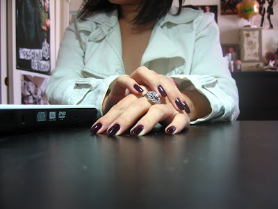
Like RBL Recycle, WAHP is a gem-like thing--yeah, okay, it doesn't sparkle, but it changes color dramatically depending on the light. It reminds me of Bordeaux--the deep plumminess is probably why, really. Don't understand why OPI calls this a "coffee" color.

Oh, and, um, yes: my polish is already very damaged. It's the second day in and I miscalculated the nail polish drying period--I just sort of left before it dried. I think it's in pretty good condition for that sort of treatment (not to mention once I go back to work it'll be ruined anyway).

So, uh, yes. This is two coats with topcoat--for anybody who's curious, it's still shiny as hell without the topcoat. I do predict, however, that it'll chip in about three or so days if this is how it's faring.

Oh, and before I forget:
As you can see, it never looks black except in extreme darkness. :) And, goddamn, I love it from further away more than I do up close. I love you, We'll Always Have Paris. Never go away.

OH, and this was the first time I'd tried out the OPI pro-wide brush. I had misgivings, mostly due to the fact that my nails are very narrow... then I found out that changin the pressure on the brush gave you better control of the range. Since I'm not ambidextrous, it's kind of obvious that one of my hands came out way better than the other, which needed heavy cleanup.

Nonetheless, I'm very fond of the pro-wide brush now!

(Sorry, guys. I had no sleep. I'm out of coffee. I am delirious.)

Friday, October 2, 2009

OPI Tijuana Dance?

God. I can never, ever, -ever- photograph this nail color well. It just refuses to be captured. Rest assured that it's not quite as boring as it seems in these images, although, to be honest, it's a boring color.

History first: this is the first nail polish color I ever bought. My nails had started bending, breaking, and peeling in high school to an extent where I couldn't ever get it to grow--I was always cutting it painfully short. I'd worn clear polish for a whole lot during the time since I'd associated polish with a girliness I'd never felt. :D

Back then I'd been wanting to branch out (safely, of course) and decided to pick out a creme pink polish, and I came away with this from the clearance bin.


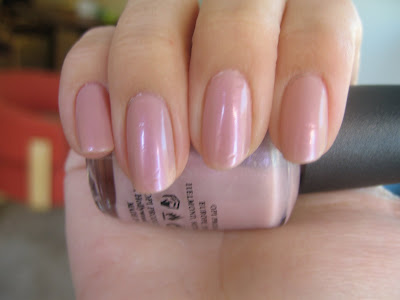
First things first: this is not a creme pink. It's a sheer, cool-toned pink frost with holo glassfleck. In the bottle, it's quite magnificent, although it shines primarily green--you can still see the pink/purple/blue flickering away on the surface. On the nail, however, the holo disappears into normal silver glassfleck.

None of these pictures are accurate in color--however, they are accurate in appropriate lighting. It really does look that sheer and transparent in bright light (not including sunlight) and so it tends to give the impression of very clean nails. Lovely and work appropriate. In shade, it turns into a deeper pink, as shown above. That's just about the right color. In the sun, however, the color metamorphoses into something in between--a very pale sort of pink with a whole lot of shine. The sun picture just will. not. capture.

What I'm wearing in the above is four (FOUR!) coats--as you can see, there's still visible nail line. I don't really think you could build up complete opacity, unless you're willing to sit there and paint about six coats all the time. Impressive wear, though: I picked out Tijuana Dance? because I was going to work, where I labor away as a night barista (less glamorous cappuccino making, more throwing out trash, prying icy pastries out of their froze boxes, scrubbing at mold--nope, I don't use gloves; I'm very hard on my hands) and I figured I needed something to help protect my nails, even if the nail polish takes the brunt of the abuse.

I always thought Tijuana was chiptastic, but apparently I need new eyes: I have one chip currently at the base of my middle finger; the other nails are scratched but still intact.

So, yees. I like that polish just marginally better now, problems with camera and twee coloring aside. If anything it's emotionally connected to my FIRST BLACK NAIL POLISH, which I'd actually used up last year.

Heh.