Holy Cow.
I've worn a lot of Lippmanns by now--four of them, actually--and I think this one is by far my favorite. I tried taking tons of pictures, but there is nothing that I've taken that can capture its incredible depth. The effect of looking at Across the Universe is like... looking at jewels underwater. It catches light in a glossy way that first reflects off the blue before the hex glitter catches a gleam. Fascinating.
Anyway, Across the Universe is one of two that Deborah Lippmann has released for her fall collection. It is a deep blue jelly base, filled with blue and green hexagonal glitter as well as blue square glitter. It took three coats--which I think is necessary--to reach this opacity, and it was also somewhat difficult to apply. I can imagine that this polish would get thick easily; I recommend a few drops of thinner. Beyond its gloopiness and the issue about glitter placement, I had little problems on application.
But can we take a few moments and just talk about the sheer awesome of this polish?
No?
I couldn't really stop staring at this while I had it on. If I've done my research right, this polish is supposed to encapsulate entire galaxies in a single bottle, but I don't think of the sky when I look at this. (In some ways, I do with Lady Sings the Blues, but whatever.) I think of the ocean, and in that way I can't find a polish more appropriate in the summer than this one. I love this.
Have a great weekend, guys! I'll be moving out in the time that you're all reading this--I'm finally, finally a college graduate!
Things will get hectic and crazy in the next month, but I'll let you all know later--for now, it's a secret! ;)
Friday, July 30, 2010
Thursday, July 29, 2010
notd (fail?): I have a question...
Look very carefully at that picture. Try to ignore its various imperfections, of which there are many--I painted this by the light of a single candle. Just look at the color.
Does it look like a gradient to you?
Look again:
(lol, sorry; say hello to my balcony/picture-taking place! Hello...)
Again, does that look like a gradient?
Because it is.
I'm afraid that the color distinction from the base of the nail to the tips was difficult to see in real life, because I'm strangely phobic about color gradients that are really obviously done. I wanted this gradient to smoothly transition between the orange and the red jellies that I've chosen, but I suppose there isn't enough area on the nail to do so without fooling the eye. It's most definitely smooth.
If it exists.
So, tell me... is that a gradient, or is that a really good gradient optical illusion?
I think I need to experiment some more...
Wednesday, July 28, 2010
Deborah Lippmann, Some Enchanted Evening
This is quite possibly the girliest manicure I've done in a really long time! It made my roommate think of valentine's day cards. It makes me think of the nonpareils on cupcakes. This is almost a little too darling for me every day, but it was cute. :)
Lippmann's Some Enchanted Evening is a clear base filled with pink square and hexagonal glitter, and applies quite sparsely: the above image is two coats of the stuff. It seems impossible,or at least, really time and polish consuming to attempt making this opaque. Related reviews and my own experience with it led me to put it on over a basic white the way I would with a normal layering polish. I didn't take any pictures of it, but I liked it very well when it was just one coat; I think that would be the way I would normally wear this polish color.
It was weird--while I was wearing this polish out, I noticed that some pieces of the small glitter seemed to take on holo properties. I couldn't quite catch it on camera, but on the eye some speckles gleam with a strong rainbow sheen that changes color with different angles. It makes me love this polish color more--by no means is Some Enchanted Evening unique, but details like that make me appreciate this one.
I also have to admit that I love the name.
Overall, I have to admit that I'm impressed with the All That Jazz collection! All three of them are keepers, and despite all being glitters, I think that the things that the colors are appropriate for allows the three to be more versatile than expected. These are keepers for sure; thank goodness!
Tuesday, July 27, 2010
Deborah Lippmann, Razzle Dazzle
I dimly recall telling my roommate that I wasn't really into sparkly dark red colors, anyway.
What. I love this. Razzle Dazzle is a lovely raspberry-colored jelly with myriads of pink glitter. There is something so incredibly juicy about this one, and it took me three coats to really get the depth and shimmer that I wanted--look, it's like a deep red version of ChG Emerald Sparkle.
This one also glimmers just so in virtually any light setting I could think of. And it was easy to apply, and actually stayed on my fingernails for a whopping four days.
Oooooooh.
If I could've gotten a really good picture of this in the sun, I'd be happy. As of now, this one picture makes me want to wear these all over again.
So far, I'm really impressed with this Lippmann collection!
Monday, July 26, 2010
Deborah Lippmann, Lady Sings The Blues
(Pardon the dent on the rightmost finger: a hex glitter fell out while the mani was half dry, which left that little mark.)
This was my first Lippmann polish, and I'm still not sure how I feel about it. I'd heard that this was going to be Ruby Red Slippers (sooo sexyyy) but blue, and that pretty much sounded like all sorts of awesome. Like RRS, Lady sings the Blues holds hex and small square glitter of the same color, but the similarities seem to end there.
For one, LStB is... not a jelly. The blue base is very, very pigmented, and covers the nail in one coat. The issue with this seems to be that the glitter within the polish sinks underneath the base, rendering all potential silveriness into a sort of murky blue.
I had expected far more glitterbombiness, but... I also like it this way. It feels classy and glamorous, like a woman in a sequined, sexy evening dress. It makes me think of hazy nights in jazz clubs, which is, I think, the inspiration behind this piece. It is sultry, attention-grabbing, but subtle at the same time: not a combination that makes sense unless you experience it yourself. I've had people grab my hands for a closer look at this polish, although I feel certain that it looks pretty much like a navy blue from far off. There's something special about this.
And despite the fact that I have other polishes, and other lippmanns to try, I keep wanting to put this one on again. It's that ineffable mystery, I guess. :)
Friday, July 23, 2010
NOTD: Shylock
Why, thou, loss upon loss; the thief gone with so much,
and so much to find the thief...
and no satisfaction, no
revenge....
nor no ill luck stirring but what lights o' my shoulders,
no sighs but o' my breathing,
no tears but o' my shedding.
(merchant of venice, III.i.78-81)
Thursday, July 22, 2010
Kleancolor, Golden Nightmare
I received this nail polish along with several other beautiful Kleancolors in a swap with Tiffani of Yardsticks 4 Lunatics! Thanks, Tiffani! I hope to show the rest of my readers some more along the way. :)
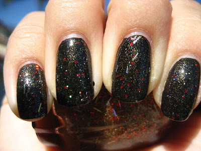
Golden Nightmare is a black creme interspersed with square golden glitter (actually, I can barely tell whether or not it's gold or whether it's olive. We'll go with some green-tinted gold, yeah?) and shimmer of the same color. This is, quite frankly, what I wanted ChG Wagon Trail to be. Wagon Trail looked somewhat dull most of the time, but Golden Nightmare patently does not--it looks like a plain black under indoor lighting, but flares to life under direct sunlight. Observe:
(Please click on the image for the best view of aforementioned sparklyflash. Thank you.)
I also found that Golden Nightmare is a perfect, fuss-free one-coater; it does, however, dry gritty due to the glitter: two coats of topcoat are necessary.
Ah, there's that visible flash I was talking about. It really makes my day. :)
Wednesday, July 21, 2010
Kleancolor, Tahiti Sunset
Um. . .
Staring at Kleancolor's Tahiti Sunset made me wonder whether or not I liked crazy glitters in theory. I had all kinds of misgivings about this polish: the yellow tone would make my stained nails look more stained, but it didn't seem to be dark enough to pull opaque. I was so sure I had plague on my hands, but I put three coats of its sheer, bronzy self to see if I could make it work.
In the pictures, it still induces a sickening reaction, but on the skin it wasn't... really bad as long as you weren't looking close up. The gold was nice. Glittery. A flash of red and holo glitter, occasionally, from its respective sources. but close up...
Ew.
are you kind of able to see what I mean? So glossy! So shiny! Even without sunlight! Still, barely passable on its own.
So I put it on over black:
This is two coats over Kleancolor's Taihti Sunset, and that was much, much better. Akin to watching confetti sprinkle through the night sky. The gold that was so prominent in the previous manicure took backstage here when over black, but the red and the holo string glitter became very prominent, glaring under certain angles.
But see that golden shimmer there? Really, that's the kind of stuff that I live for.
I supposed that meant that I really did like funky glitter in theory.
Then I met the Lippmann collection, which you will be seeing this week.
Friday, July 16, 2010
Borghese, Stellare Notte
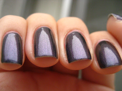
I feel the need to apologize for the upcoming images because they were taken during a cloudy afternoon (it's cold in southern california, which is... strange. I'm still recovering from a nasty cold I've picked up because of it), and although the duochrome effect of this polish was immediately evident, the camera didn't pick it up.
The next few pictures are me trying to get the shift to show up on picture. It wouldn't. But you can kind of see that slight blue tint on the finger second to the left, right? Right?
Urgh. Anyway.
Stellare Notte applies in two coats--like usual, I found Borghese's brush to like giving me cuticle drag on the first coat, but a light hand saved the application process. It is a moody old polish, one that reminds me of black pearls. The purple to green flash on its deep blue-purple shimmery base is fascinating, constant, and subtle. I got more than a few compliments on this polish, and it's warming me to the duochrome thing...
Urgh, I'll have to take these pictures again anyway.
Franken, Pink Pirouette
First hint that your nail polish obsession (I affectionately call it "My Crazy") is beginning to rub off on the people you live with: they start making frankens. After I came back to the apartment last weekend, a roommate of mine bounded in and said, look at this color! You should try it; I just made it. And then you can post it up on your blog!
Apparently I'm not very good at hiding the Crazy in the closet.
I'm... not actually sure what it is. A pink-purple-grey creme-jelly thing. Sometimes, in indoor lighting, it even looks taupe. I did know that it looked soft and sweet and feminine, and so I named it Pink (?) Pirouette, among other things, and this was the name that she liked. It applied horrifically, and took two to three coats to get it to look the way it does on me; she claims that it took four on her. On the other hand, it wears ridiculously well--I took it off due to ADD, and not because it chipped.
The recipe is as follows:
-1/2 bottle of a sheer pink (roommate used Artistry Happiness, which, I assume, leans slightly purple from the color that it became)
-5 or so drops of black (roommate used WnW Black, a nail board favorite)
-shake well.
(Do you see what I mean about the taupe, now?)
So, roomie, I hope you're happy! For what it's worth, I think this is an excellent color with excellent wear time. And, of course, right up your essie-loving alley. Good stuff.
Wednesday, July 14, 2010
Piggy Polish, Poet-Tree
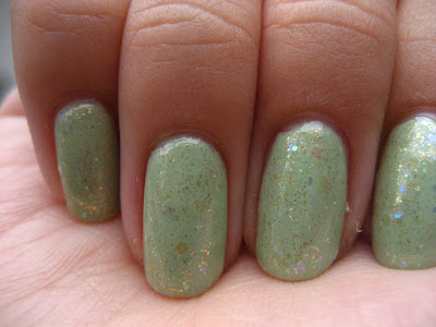
While everybody's out there in search of the perfect mint green, why has nobody talked about Poet-Tree yet? I'll confess: I bought it for the name, but it's just about trumped all the pastels that I own. I love the color--it reminds me of that avocado kitchen color in the 60s. It reminds me of Jadeite. It reminds me of vintage stuff in general.
Jeebus, I love this color. It even made me bust out my long-shelved, favorite glitter-toppings, Chanel Illusion D'or and Pa A125:

Still one of my favorite NOTDs yet.
Tuesday, July 13, 2010
NOTD: blue skies
Accomplished with two coats of China Glaze For Audrey as a base, and then sponged with a basic white on a makeup sponge for a realistic, cloudy effect. :P Easy peasy!
Monday, July 12, 2010
Franken, Felix in Amore
So, I had this theory: frost-ish shimmers + clear would eventually chill the eff out once you threw in enough clear. In fact, I presumed that enough clear in a shimmer would eventually allow the shimmery particles to float in a sheer base. I also figured that enough coats of a sheer would eventually make it opaque, thereby creating a softly shimmery pastel jelly. Yum yum!
I was mostly thinking these things because I had this horrific hate relationship with Sinful Colors' Sharon's Heart. Remind me to show you a picture sometime soon, but it was 1) really bad with my skin tone, 2) a color my mother used to like maybe six years ago, 3) weirdly twee, and 4) flashed a sick green. I liked the hint of green in Sharon's heart, and wondered if it would be preserved if I tested my theory on it.
Not necessarily, but I liked the color anyway: the result was Felix in Amore (latin for Lucky in Love), which I would consider remotely successful. The color is a sheer pink with gold shimmer that took three coats for opacity.
It's not, by any means, an original color: I imagine that Felix comes really, really close to NYX Jillian, and is even a kissing color to the ever-popular ChG, Strawberry Fields (SF is glass-flecked, though). I'm proud of it nonetheless, and it's nice to own a pink for the ever-dreary professional-color future. And this is such a fun color during the summer! This is the color that a friend of mine chose to wear on our Disneyland escapade, where our hands looked like this:
The downward hand is hers, wearing Felix in Amore with a Dazzled by Gold tip (she called it her princess nails since it looked as though she had a tiara on each finger). The upward hand is mine, wearing OPI's Absolutely Alice, of course. :P
Friday, July 9, 2010
pa A45
I've been really into sheers with glitter lately, so I figured I'd try putting on one of my favorites to see how crazy I can be. This is paA45--and I forgot how many coats it was. I am tempted to say four... but I'm not sure.
This manicure reminded me of japanese nails, in a weird way--sheer, and sparkly, and so ridiculously feminine.
:) I kind of love it.
Subscribe to:
Comments (Atom)


